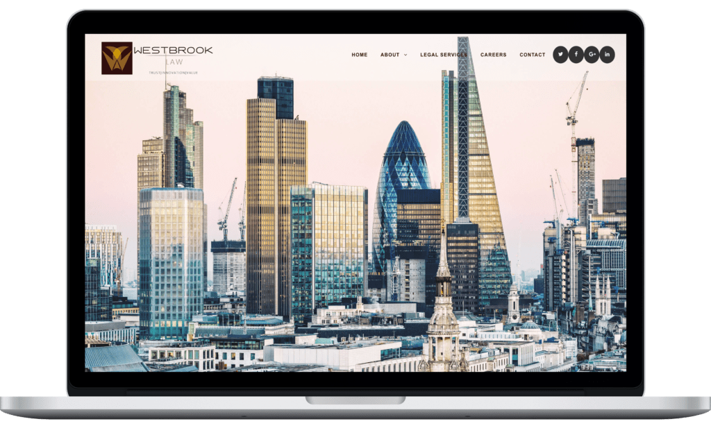
Westbrook law is a London based law firm which provides legal services. I was hired by the agency’s founder, Abdul Shahul, to redesign their website after they rebranded the firm. He wanted to modernize the design and improve the user experience.
It is very important to have a systematic approach when there are a variety of business requirements, constraints, and user needs to consider.
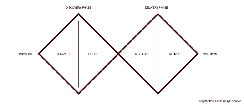
The project was carried out in two phases – discovery and delivery phases based on double diamond design rule popularized by British Design Council
The project was carried out in two phases – discovery and delivery phases based on double diamond design rule popularized by British Design Council
During Discovery phase, users were exposed to a problem area, pain points were recorded, and the context of use of the website was assessed. Deliverables included personas, sitemaps, wireframes.
In the delivery phase, the ideas were translated into prototypes and UI with interactive design was achieved as deliverables
Discovery Phase:
In order to launch design projects in the right direction, discoveries are crucial to identifying the right problems and, consequently, building the right thing. I strongly believe that defining what problems to solve, how a solution should work, and what things to be focused on are the key aspects of any successful design process.
To begin our project, we investigated both internal (company) and external business users to outline how the website should work, along with how it should look and how it should function.
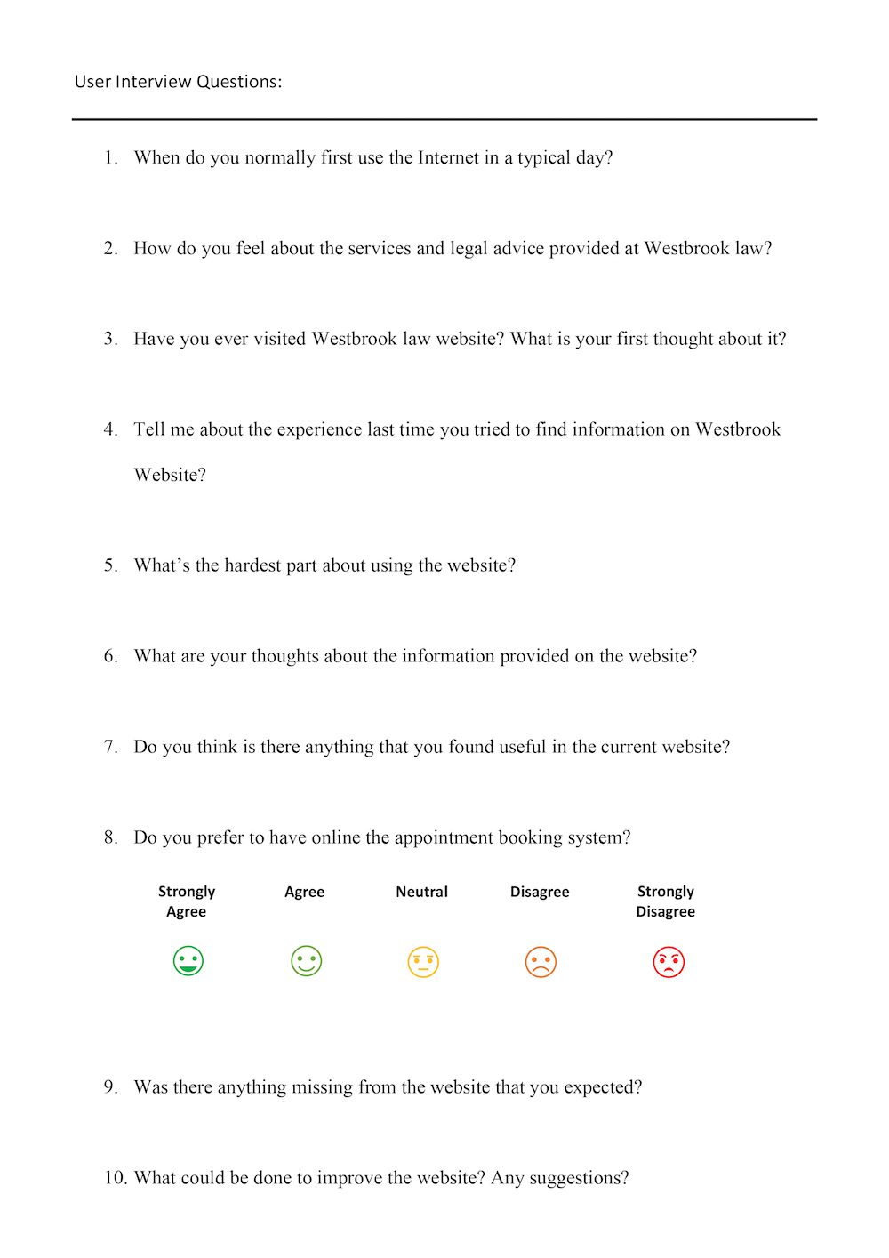
The user interview forms were used for external users such as clients and service users
Stakeholders interviews were conducted to gather and understand business requirements and constraints.
Staff (Training, support, paralegal)
Interviews were conducted to gain more insight of the pain points the users are experiencing.
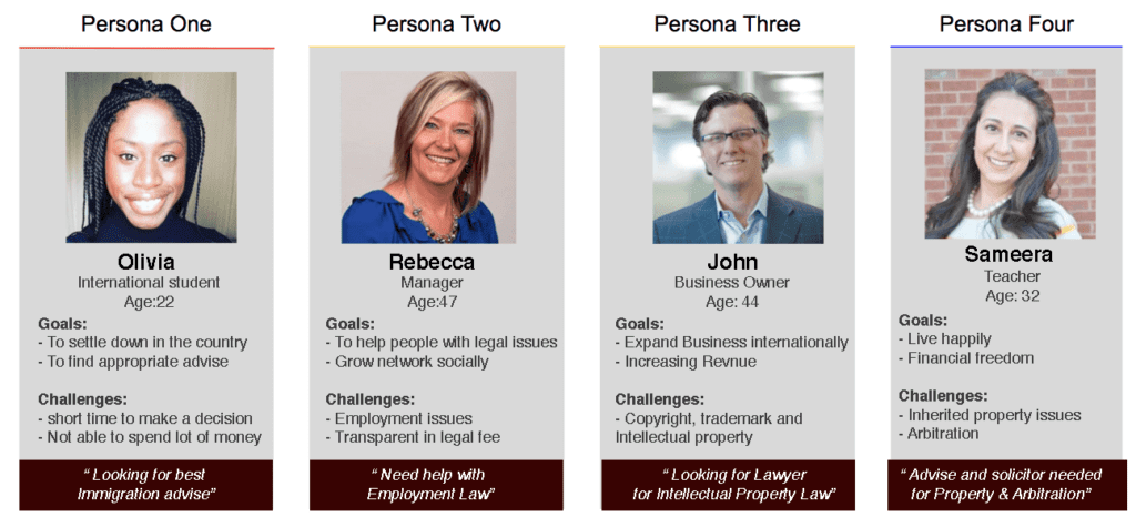
Personas: User personas were created to translate the user data into user centered design. User scenarios were created to understand the user needs and the pain points they were facing.
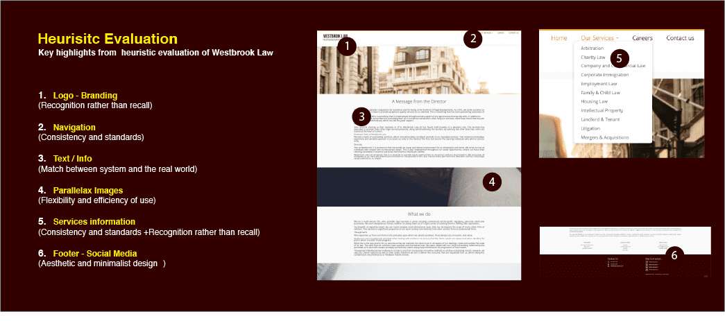
Further to the Personas and user scenario’s the Jacob’s 10 Usability Heuristics were applied and following results were derived.
Discovery Phase:
In order to launch design projects in the right direction, discoveries are crucial to identifying the right problems and, consequently, building the right thing. I strongly believe that defining what problems to solve, how a solution should work, and what things to be focused on are the key aspects of any successful design process.
To begin our project, we investigated both internal (company) and external business users to outline how the website should work, along with how it should look and how it should function.
The website and the contents proved the improper branding, Information Architecture, content and contact information. Since, Branding is one of my skills, I worked on Branding with creation of Logo, Brand Colours and Brand Guidelines. (Westbrook Branding-hyperlink)
Information Architecture:
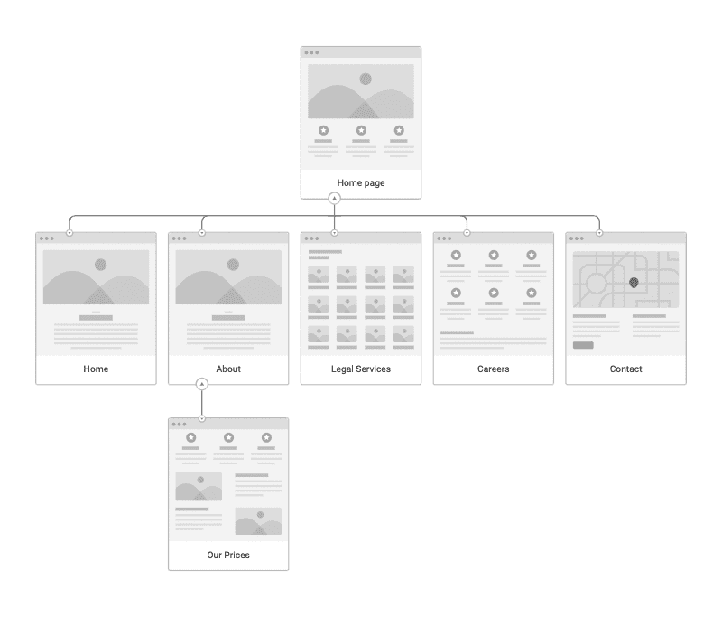
Sitemap: Part of Information Architecture (IA) and to benefit the user to easily navigate through the website, a site map was prepared with minimal levels.
Content Rearrangement
A clear content list helped me to determine what elements to include on each page.
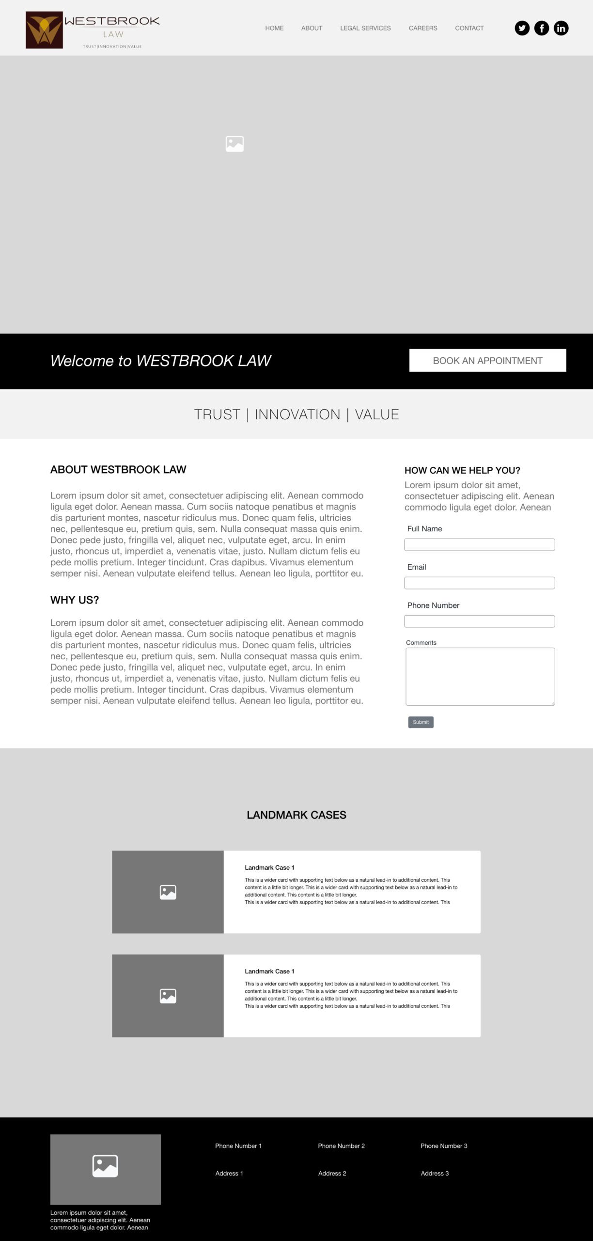
Homepage — Landing page with fresh look and easy navigation, CTA’s and regulatory body information.
Services — Short copy for each service rather than long-form essays no one wants to read. It’s about teasing prospects just enough to get them to contact you. It would help them be familiar enough with your value proposition.
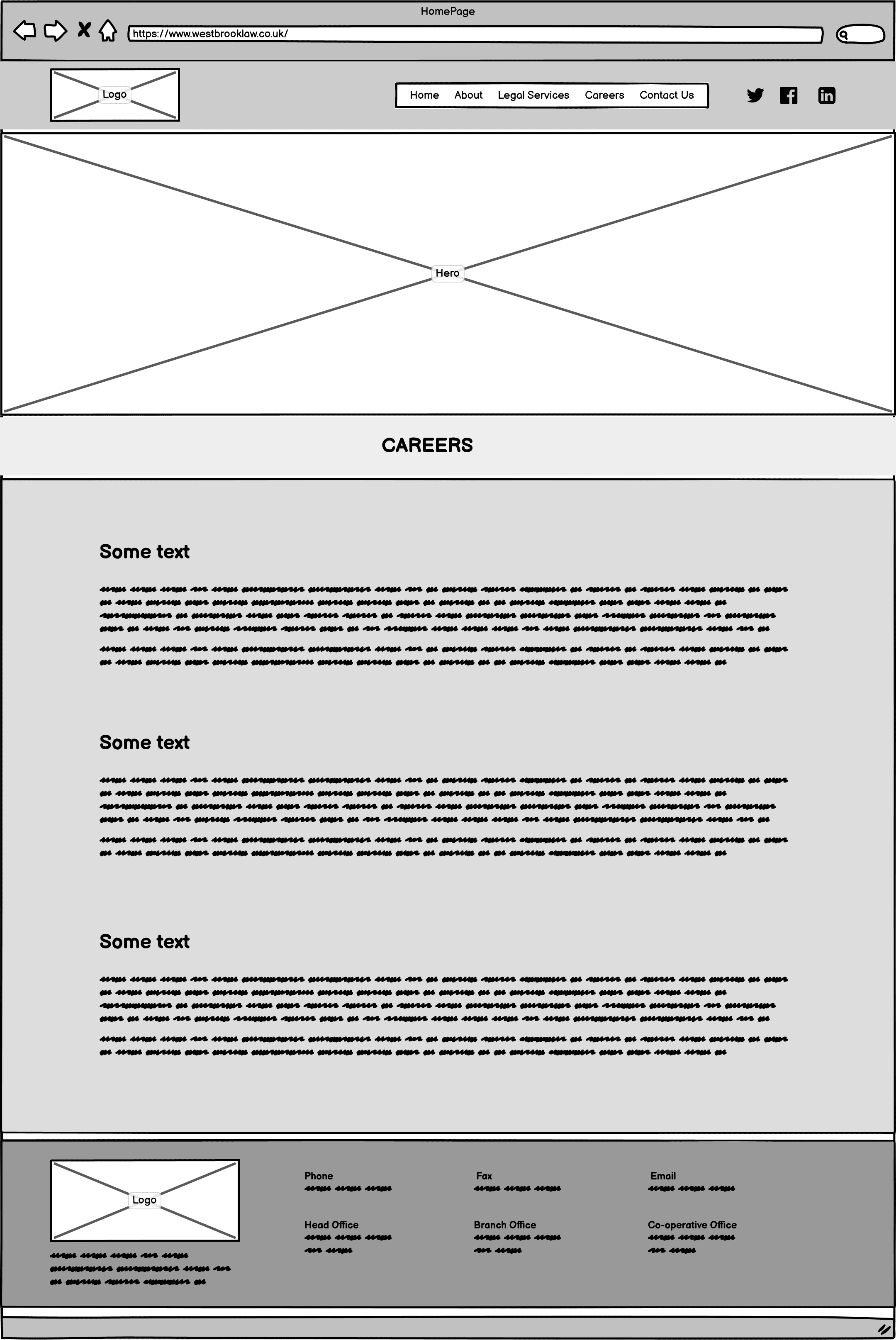
Careers — To show case and facilitate the visitors to apply any possible job prospects within the company
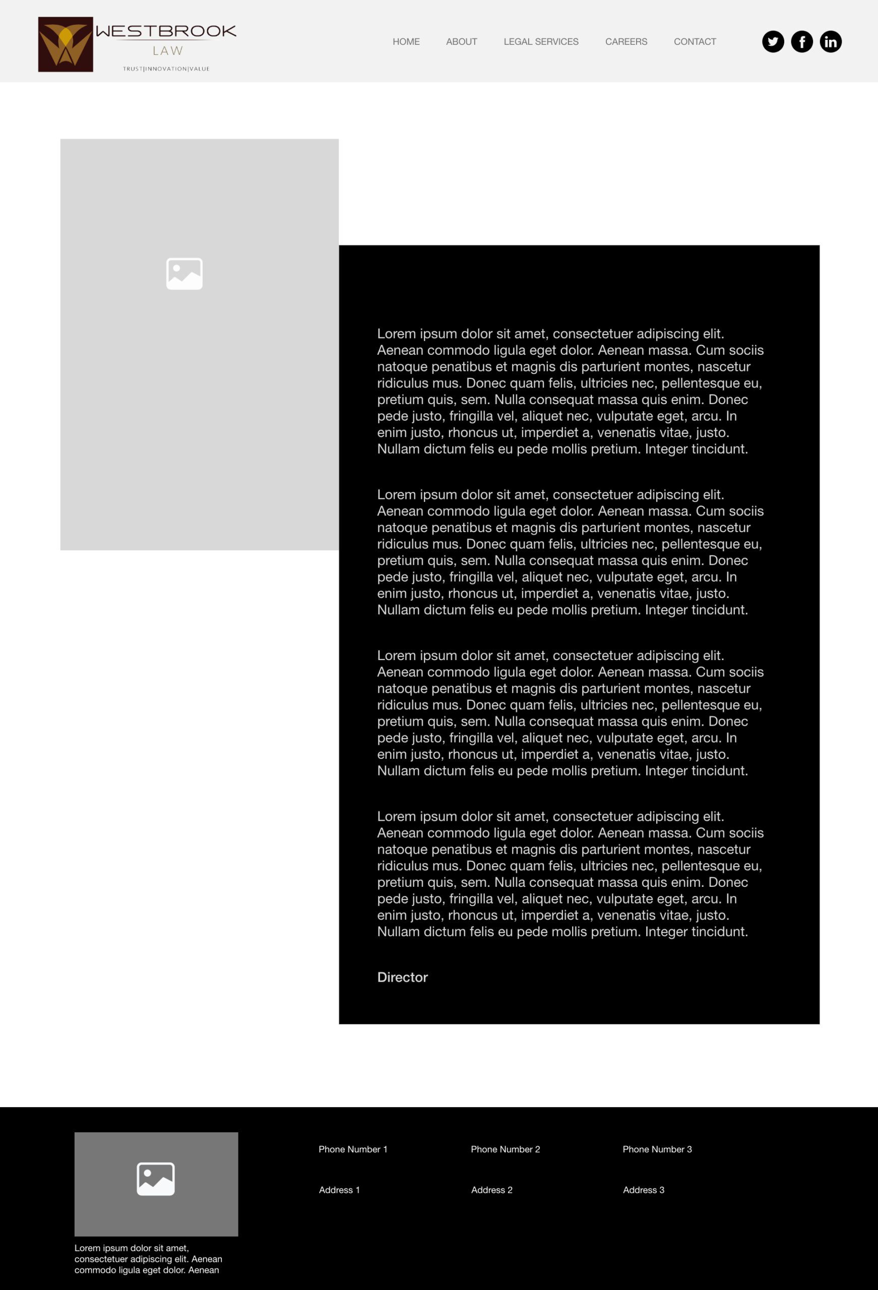
About —Presenting the Director’s message vision, mission of the company.
Our prices – Prices and fee structure is a mandatory requirement of regulating body for the legal services provided.
Before entering into the delivery phase I decided to define the problem statements precise based on the User Research & business constraints to build the right thing.
Navigation is a nightmare
Chunks of information all over the website
Difficult to find contact information
Online appointment would be great
Regulatory body information (SRA)
Best Case studies to reflect the services provided
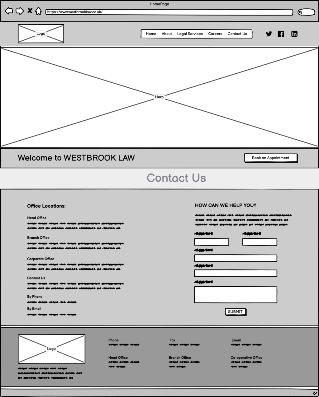
Contact form and social media links to follow updates
Delivery Phase:
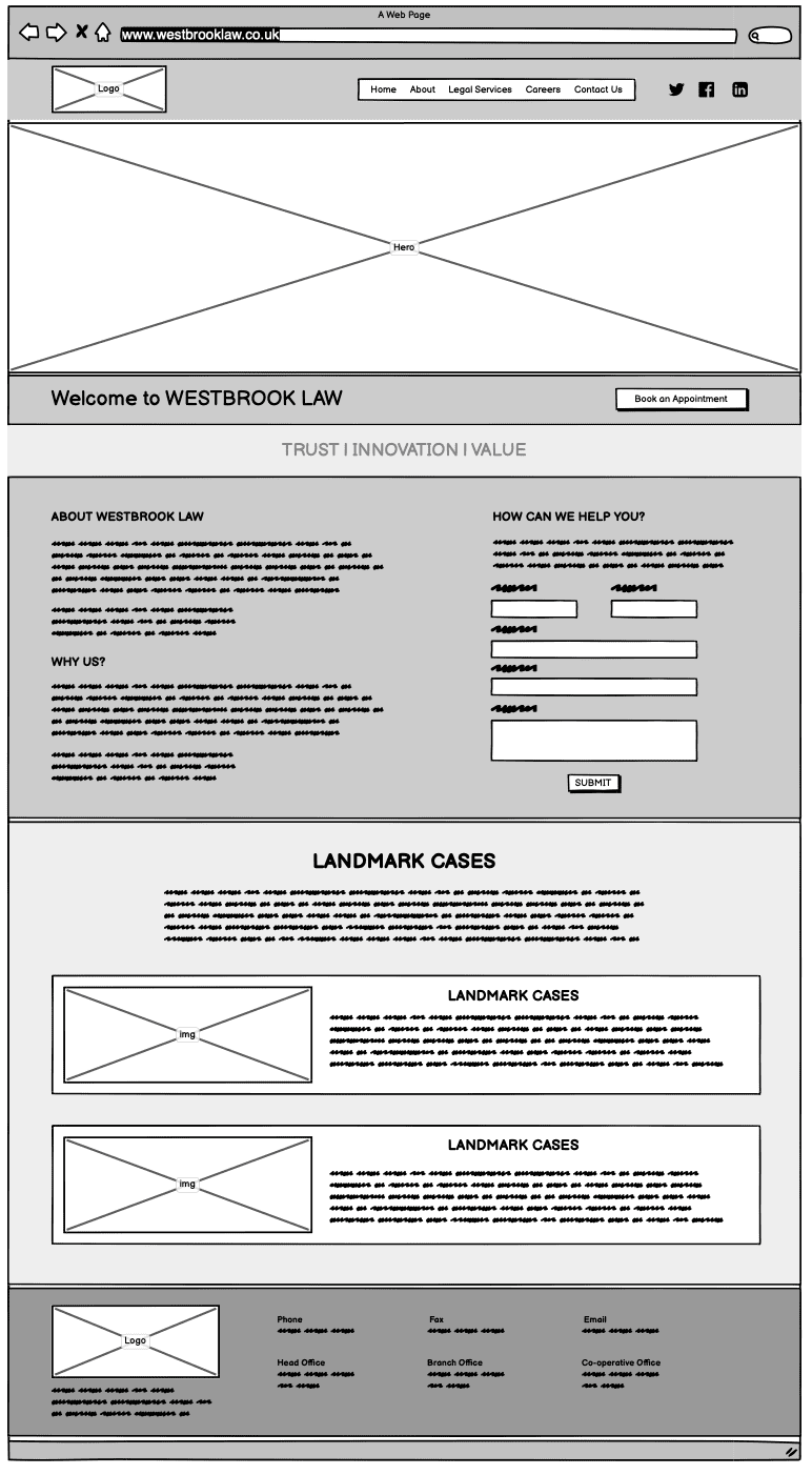
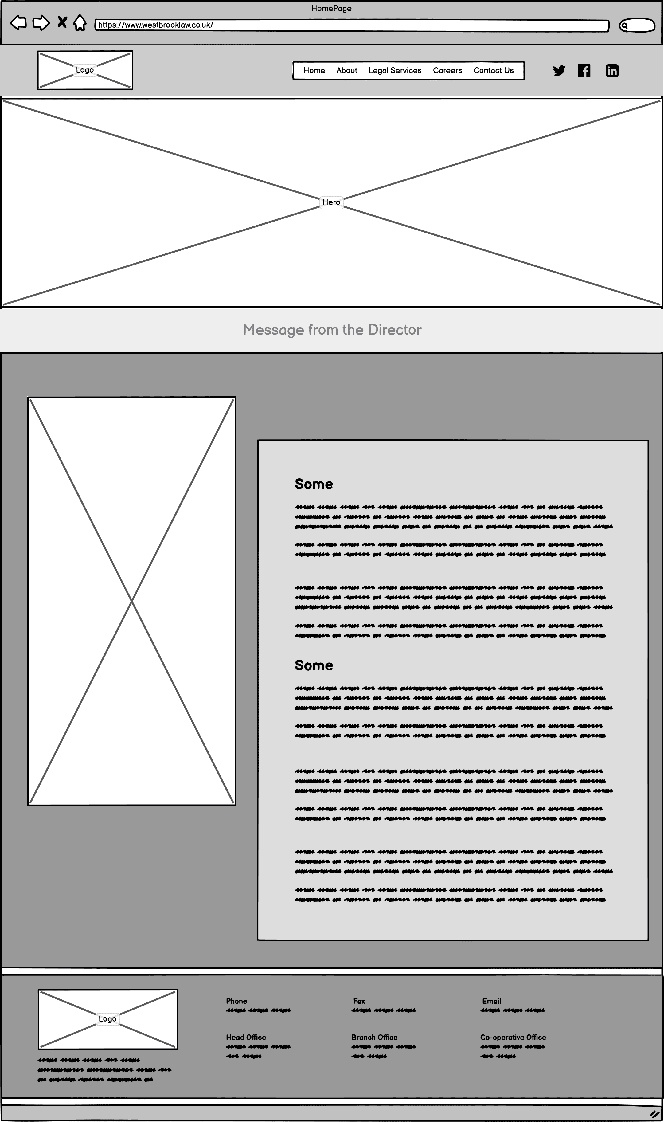
Low fidelity Wireframes:
In order to get a feel for the overall composition of the website, I did low-fidelity designs of how each page could potentially look and what kind of content would be displayed.
High fidelity prototypes were designed in Adobe XD and pages were developed using PHP.
Home
About
Careers
Contact
Landing Page
About
What has been achieved?
Increase in site performance and
Two months after launch, when A/B Testing & Google analytics numbers were assessed,
120% increase in avg. number of pages viewed per session
33% reduction in the bounce rate
42% reduction in avg. page speed
Customer was happy with User centered design, results and site performance.